Painting 2/4 – Underpainting

- Composition
- Coloured base (underpainting)
- Painting loose
- Adding details to the focal points
The color base, also known as underpainting, has two main purposes:
- to determine lights and shadows at the very beginning
- to harmonize or contrast with all subsequent layers. Underpainting will help that colours look more compatible with each other and will "make" them follow the chosen mood of the painting
If we skip this step, it is possible that our finished painting looks like it was done with office markers and the white canvas may be visible at some places.
We apply the color base without much focus on the details, using one or two colours. It should be completely dry before we apply next layers. There are several methodologies to choose underpainting colours:
-
Easy way – we use a nice photo as a reference and we expect that our painting is as realistic as possible. The colour for underpainting would be raw umber or indigo (like in old photo).
-
Medium diffuculty – we want to turn boring picture into an interesting painting by altering the color palette. We use harmonious (complementary) colors - these are all adjacent on the color wheel. For example, yellow ochre is a harmonious color for painting green vegetation. A green underpainting for green vegetation would be a bad choice because it will make the scene monotonous.
-
Very difficult - we want to turn boring picture into an interesting painting like the impressionists tend to do it. We are not striving for realism, but rather impact. For underpainting we should use colors which are in contrast to subsequent layers. On the color wheel these are the opposite colours. It is important that the underpainting remains uncovered in some places after the painting is finished. For this purpose, the paint should be thick and the brush - hard. For example, a landscape with a predominance of green and blue can be recreated quite interestingly with an orange or pink color base. It is possible that a blue-green lizard on a rusty fire extinguisher dumped by the sea looks much more beautiful than the most beautiful waterfall in the world. This is due to the simple reason that blue-green and red-brown (rust) play well together as contrasting colors.
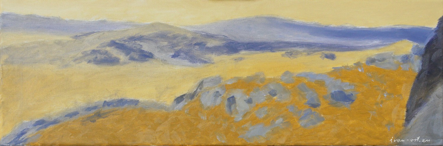
For my painting I tried to use harmonious base by using yellow ochre and white for lighter places and "purple" for darker ones. I mixed the purple color incorrectly and got a bluish tint.
Wrong colours in the underpainting is not always a big problem because most important is that shadows are dark enough. If something doesn't look bright enough, we can always make the adjacent areas darker and it will immediately stand out. Trying to make light areas look lighter by adding white paint doesn’t lead to success.
We should not worry about using ochrе where the sky and water are, as long as we wait for it to dry completely before applying the next layers.